How to Adjust Liquid Glass Transparency in macOS 27
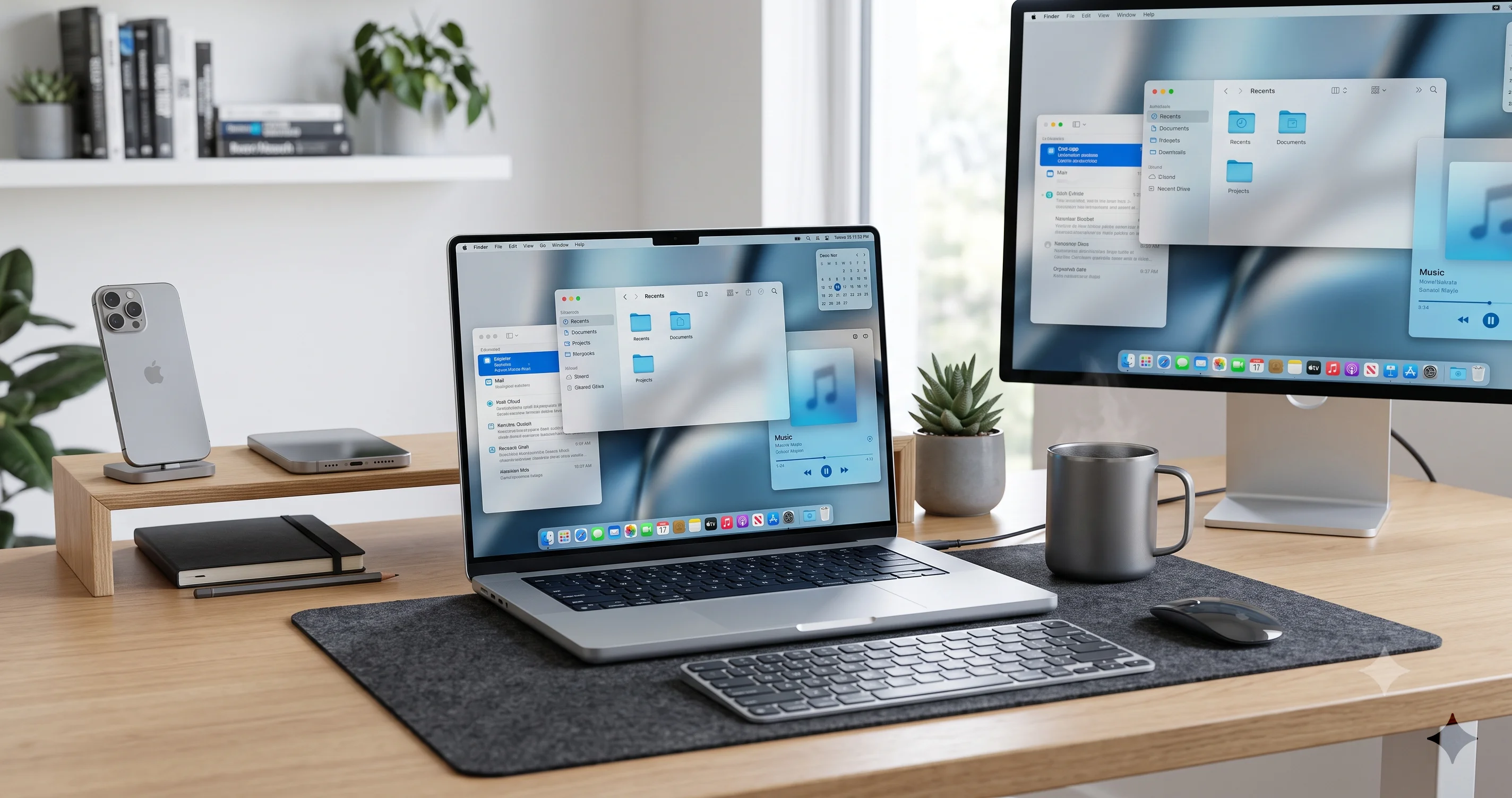
macOS 27 Golden Gate adds a real Liquid Glass transparency slider. Learn how to adjust opacity, fix menu bar legibility, and tune the look on your Mac.
The single loudest complaint about last year's redesign finally has a real answer. Liquid Glass transparency in macOS 27 "Golden Gate" is no longer an all-or-nothing accessibility switch buried three panels deep — it is a proper, mainstream slider that lives right in System Settings, and it lets you dial the see-through, frosted look up or down to taste. When Apple shipped Liquid Glass in macOS Tahoe, the material was gorgeous in marketing screenshots and genuinely divisive in daily use: the menu bar washed out over bright wallpapers, sidebar text fought with whatever was behind it, and the only escape hatch was a blunt on/off toggle that killed the effect entirely. macOS 27 responds directly to that feedback with granular control, and this guide walks through exactly how to use it.
Before we go further, read this caveat twice: everything here describes beta software. macOS 27 was announced at WWDC on June 8, 2026, and as of mid-July 2026 it is in developer beta (developer beta 3 landed as build 26A5378j on July 6, with a revised 26A5378n following on July 13), with the first public beta having opened on July 13, 2026. The transparency slider is real and confirmed in beta coverage, but its exact name, its precise location in System Settings, the label on the control, and even how many stops it offers can all change before the general release expected in the fall. Where I am not certain a detail is final, I say so and describe the workflow generically on purpose, because guessing a settings path that Apple renames next month helps nobody.
Key Takeaways
- macOS 27 adds a native Liquid Glass transparency slider in System Settings — a mainstream, granular control that did not exist in Tahoe, where your only option was a blunt Accessibility toggle. You can now tune the frosted-glass look rather than switch it fully on or off.
- This directly targets Tahoe's number-one complaint: menu bar and text legibility over busy or bright wallpapers. Pulling opacity toward the solid end restores contrast without abandoning the redesign wholesale.
- The new slider complements, not replaces, the old accessibility approach. Reduce Transparency and Increase Contrast still exist and still have their place; the slider gives everyone in between a middle ground that the binary toggle never offered.
- Everything here is beta behavior. The control's name, location, wording, and number of steps can change before the fall 2026 release. Treat exact labels and menu paths as provisional and read what your build actually shows on screen.
- macOS 27 is Apple-silicon-only — the first macOS to drop Intel support and the last to include Rosetta 2. Transparency and blur are GPU work, so the slider is also a small performance lever on lower-powered Macs and multi-display setups.
- It arrives alongside a broader design cleanup: standardized, less-rounded window corners, edge-to-edge sidebars, colored sidebar icons, bolder active-tab text, better window shadows and borders, and a reintroduced "glove" cursor — all aimed at the readability critiques Liquid Glass drew in Tahoe.
What Liquid Glass Is and Why Tahoe Drew Complaints
Liquid Glass is the name Apple gave to the translucent, layered material that defines the modern macOS look. Menu bars, sidebars, the Dock, toolbars, popovers, notifications, and Control Center are rendered as sheets of digital glass that blur and tint whatever sits behind them, so your desktop wallpaper and window contents subtly bleed through the interface chrome. It is the successor to years of "vibrancy" and translucency work, pushed much further: more depth, more real-time blur, more of the interface behaving like frosted glass floating above your content. On the right wallpaper, at the right moment, it looks fantastic.
The problem is that "the right wallpaper" is doing a lot of work in that sentence. Translucency is only legible when there is enough contrast between the text on the glass and whatever bleeds through from behind it. Put a menu bar full of thin white-ish glyphs over a pale sky wallpaper, a bright document, or a busy photographic desktop, and the glass material and the content behind it converge toward the same brightness. The result is menu items and status icons that fade into near-invisibility, sidebar labels you have to squint at, and a general sense that the interface is fighting your content instead of framing it. This was not a rare edge case — it was the everyday experience for anyone who did not happen to run a dark, low-contrast wallpaper.
That legibility gap became the defining criticism of the Tahoe redesign, and it was loud. The complaint was rarely "Liquid Glass is ugly" — plenty of people liked the look — it was "I can't reliably read my own menu bar." We wrote about the broader backlash in our Liquid Glass design controversy analysis, which traces how a visually ambitious material collided with the practical reality that people need to read interface text at a glance, every second of the day, regardless of what is on the screen behind it.
The Tahoe workaround: a blunt on/off toggle
Tahoe did give you an escape hatch, but it was a hammer, not a scalpel. The fix lived in System Settings > Accessibility > Display > Reduce Transparency, a single toggle that, when switched on, replaced most of the translucent materials with opaque, solid backgrounds. It absolutely solved the legibility problem — a solid menu bar is perfectly readable over any wallpaper — but it did so by throwing out the entire aesthetic. There was no "a little less see-through." You either lived with the glass and its legibility swings, or you turned it off and got a flatter, more utilitarian interface that looked nothing like the design Apple was promoting. Pairing it with Increase Contrast hardened borders and text further, again at the cost of the soft, layered look.
We documented that whole Tahoe-era toolkit in the macOS Tahoe Liquid Glass customization and accessibility guide, and it is still the right reference if you are running Tahoe today. The key thing to understand for this article is that Tahoe's model was fundamentally binary. Reduce Transparency was designed as an accessibility accommodation — an all-or-nothing safety valve — not as a design preference you could tune. Millions of people wanted a dial. Tahoe only had a switch.
What's New in macOS 27's Approach to Transparency
macOS 27's headline answer is exactly the dial people asked for. According to beta coverage from outlets including MacStories, Six Colors, and 9to5Mac, macOS 27 adds a Liquid Glass transparency (opacity) slider as a mainstream System Settings control. Instead of "glass on" versus "glass off," you get a continuous range: pull it one way for the full, airy, translucent look, pull it the other way for a more solid, frosted, higher-contrast material that keeps the spirit of Liquid Glass while dramatically improving legibility. The blunt toggle becomes a spectrum.
This is a meaningful philosophical shift, not just a new widget. In Tahoe, adjusting transparency was framed as accessibility — something you reached for if the default was unusable for you. In macOS 27, tuning the glass is framed as a normal appearance preference, the same category as picking light or dark mode or an accent color. Apple is implicitly conceding that the default translucency was too aggressive for a lot of people and that "how see-through do you want your interface" is a legitimate thing for any user to decide, not a special accommodation. That reframing matters because it means the control is discoverable and mainstream rather than hidden in an accessibility corner.
The slider does not arrive alone, either. macOS 27 pairs it with a cluster of related refinements that all push in the same direction — toward readability and visual calm. Beta builds show standardized, less-rounded window corner radii (the corners are more consistent and a touch tighter than Tahoe's), edge-to-edge sidebars that remove the floating glass "sheet" look in favor of sidebars that meet the window edge, colored sidebar icons that are easier to scan, bolder active-tab text so the selected tab is unmistakable, and improved window shadows and borders that better separate a window from whatever is behind it. There is even a reintroduced "glove" cursor and crisper, glass-style app icons. Taken together, this is Apple spending an entire release cycle sanding down the rough edges of the redesign it shipped the year before.
Confirmed in beta vs. still moving
Because this is beta software, it is worth being precise about confidence levels. What is well-supported by multiple beta reports: that a transparency/opacity slider for Liquid Glass exists in macOS 27 System Settings, and that the surrounding design changes above are present in current builds. What is not yet nailed down: the slider's exact final name, whether it lives under Appearance, Accessibility, or both, the precise wording of its label, how many discrete stops it offers (if any), and whether its behavior is identical across every app and system surface. Apple frequently relabels and relocates controls between the first beta and the September release, so anywhere I give a specific path below, read it as "here is where it logically sits and where current builds put it," not "here is the final, permanent address."
How to Find and Use the Transparency Slider
Here is the practical part. The workflow follows the standard System Settings pattern, so if you have ever changed your Mac's appearance, you already know most of the moves. I am describing the current-beta experience; confirm each label against what your build actually shows.
Step by step
- Open System Settings from the Apple menu (top-left of the screen) or from the Dock.
- Go to the Appearance controls. In current macOS 27 betas the transparency slider is associated with the appearance and display look of the system. Check the Appearance section first, and if it is not there, check Accessibility > Display, because Apple has historically kept transparency controls under Accessibility and may surface the slider in both places. The exact home is one of the details that can shift before release.
- Locate the Liquid Glass transparency (or opacity) slider. It will read as a horizontal slider with more-transparent at one end and more-solid/opaque at the other. The label wording is provisional — do not go hunting for one exact string; look for the transparency concept.
- Drag the slider and watch the interface update. The menu bar, sidebars, Dock, and other glass surfaces respond live as you drag, so you can see the effect in real time rather than committing blind. Pull toward the solid end and the frosted material gets denser and the text behind it recedes; pull toward the transparent end and more of your wallpaper and window content bleeds through.
- Find your comfortable middle. For most people fighting legibility, a setting somewhere between the midpoint and the solid end restores readable contrast while keeping a hint of the glass look. There is no universally correct value — it depends on your wallpaper, your eyesight, and your taste.
- Leave it and use your Mac for a while. Live in the setting for a day before deciding. Glass legibility is context-dependent — it changes as you switch wallpapers, open bright apps, and move between light and dark mode — so judge it across your real workflow, not one screenshot.
I am deliberately not quoting a single canonical menu path as if it were final, and I am not inventing a keyboard shortcut, because in a beta those are exactly the things Apple changes. Trust the shape of the workflow — open System Settings, find Appearance or Accessibility, drag the transparency slider, watch it update live — and read whatever the current build actually presents.
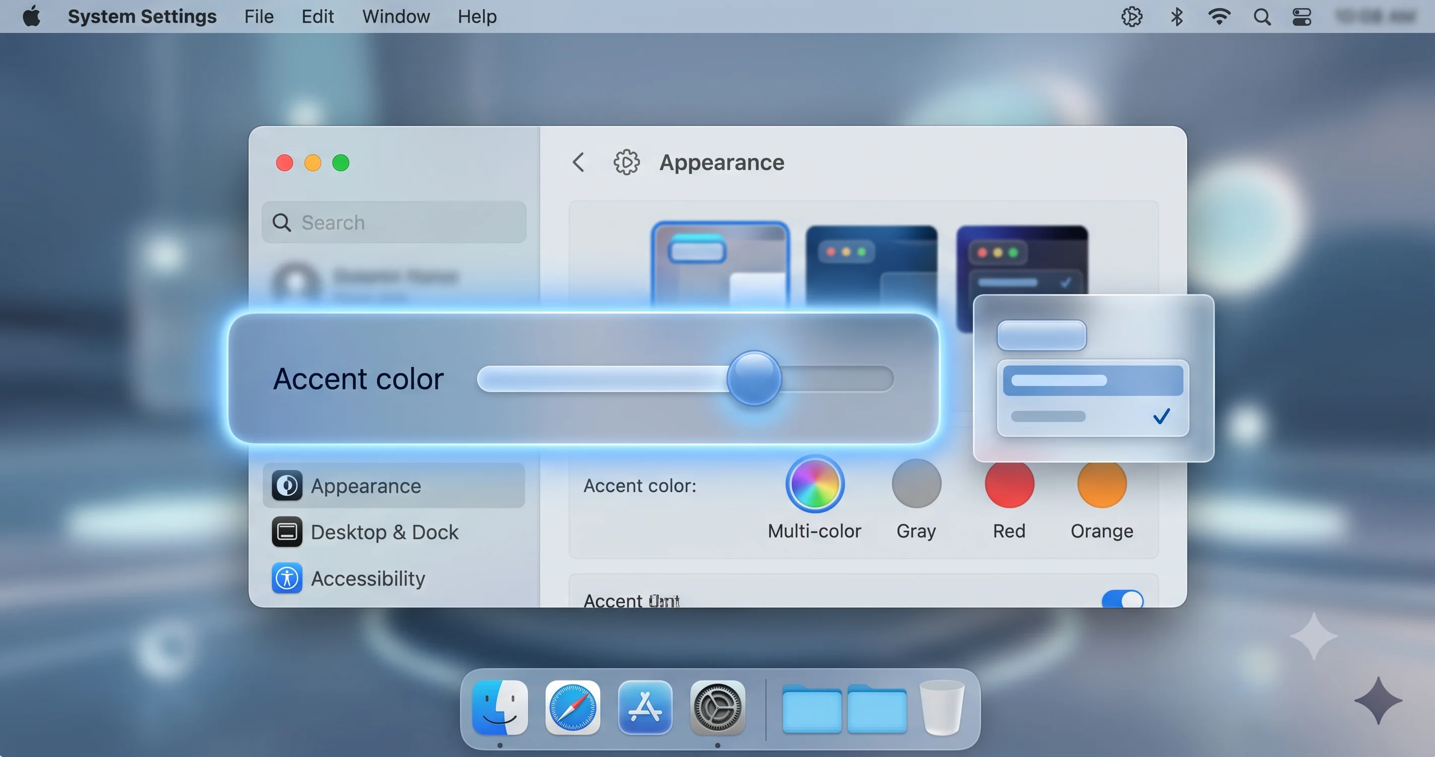
What the slider actually changes
When you move the transparency slider, you are adjusting how much of the content behind a glass surface shows through and how much the material blurs and tints it. Toward the transparent end, the blur is lighter and more of the underlying wallpaper or window content is visible, giving you that airy, layered depth. Toward the solid end, the material becomes denser and more frosted — closer to an opaque panel with a faint tint — so text and icons on top of it sit against a stable, high-contrast background regardless of what is behind them. It is best understood as a continuous blend between "clear glass" and "frosted-to-solid panel," with the whole range in between available to you. That continuity is the entire point: Tahoe gave you the two endpoints only; macOS 27 gives you everything in the middle.
Interaction with light and dark mode
Do not evaluate the slider in only one appearance mode. Liquid Glass behaves differently in light mode than in dark mode, because the material tints toward light or dark and the contrast math with your wallpaper changes completely. A transparency level that reads beautifully in dark mode over a dark wallpaper can wash out in light mode over a bright one, and vice versa. If you switch between light and dark during the day (or use auto appearance), check your chosen transparency level in both, and set it for the worse of the two so you are never stuck squinting.
The Old Reduce Transparency Toggle vs. the New Slider
This is the comparison at the heart of the article, so let me be explicit. In Tahoe, your control was System Settings > Accessibility > Display > Reduce Transparency — a single on/off switch. On meant "replace translucent materials with solid ones," off meant "full Liquid Glass." Two states, nothing between them. It was built and categorized as an accessibility accommodation, and it worked, but it was a sledgehammer: turning it on gave you legibility by discarding the design.
In macOS 27, the new transparency slider is a continuous, mainstream appearance control. Rather than choosing between two extremes, you choose any point along the range. The philosophical difference is that the slider treats transparency as a preference everyone is entitled to tune, while the old toggle treated it as a special-needs override. Practically, the slider supersedes the toggle for the large group of users who found Tahoe's default too transparent but did not want to nuke the effect entirely — those people never had a good option before, and now they do.
Crucially, the slider complements rather than fully replaces the accessibility switch. Reduce Transparency (and its companion, Increase Contrast) still exists in macOS 27 and still serves its purpose. If you have a genuine accessibility need for maximum, guaranteed opacity and hardened contrast with no glass at all, the accessibility controls remain the definitive, dedicated tool, and they may push further toward fully solid surfaces than the appearance slider's solid end does. Think of it as a two-tier system: the appearance slider is the everyday dial for taste and comfort, and the accessibility toggles are the strong, dedicated accommodation for people who need a hard guarantee. For a full tour of the accommodation side of macOS, our macOS Tahoe accessibility complete guide covers Reduce Transparency, Increase Contrast, and the rest of the display accommodations in depth, and the same concepts carry into macOS 27.
A simple way to decide which to use
- Use the transparency slider if your goal is "I like Liquid Glass but it is a bit too see-through for comfortable reading." Dial it toward solid until the menu bar and sidebars read cleanly, and stop there. You keep the aesthetic and gain legibility.
- Use Reduce Transparency (accessibility) if your goal is "I need the interface to be reliably solid and high-contrast, full stop," for vision or focus reasons. It is the stronger, purpose-built guarantee.
- Use both together if you want the accessibility hardening and still want to fine-tune the residual look. They are not mutually exclusive; the accessibility toggle sets a strong floor and the appearance controls tune around it.
Beyond Transparency: Corner Radius, Sidebars, and the Cursor
The transparency slider gets the headlines, but the readability story in macOS 27 is broader than one control, and the surrounding changes matter for how legible your interface feels day to day. If you want the full feature and compatibility rundown, our coverage of macOS 27 Golden Gate announced at WWDC 2026 sets the release in context; here I will focus on the design refinements that affect legibility.
Corners, sidebars, and shadows
Tahoe's redesign leaned into very rounded corners and floating glass "sheets" for sidebars, which looked soft but sometimes made the interface feel indistinct — windows and panels blurred into one another and into the desktop. macOS 27 tightens this up. Beta builds show standardized, less-rounded corner radii so window and panel corners are more consistent and a touch crisper, and edge-to-edge sidebars that remove the floating-sheet effect: the sidebar now runs to the window edge rather than hovering as a separate pane of glass. Alongside that, improved window shadows and borders give each window a clearer outline, so it separates cleanly from whatever is behind it. None of these are toggles you set — they are baseline changes — but together they reduce the visual mushiness that made busy screens hard to parse in Tahoe.
Colored sidebar icons and bolder active tabs
Two smaller changes punch above their weight for scannability. Colored sidebar icons return meaningful color to the left-hand navigation in apps like Finder and Mail, so you locate items by color and shape rather than parsing a column of monochrome glyphs. And bolder active-tab text makes the currently selected tab unmistakable at a glance, fixing a common Tahoe frustration where the active tab was only subtly distinguished from the inactive ones. Both are about reducing the moment-to-moment cognitive effort of reading the interface.
The return of the glove cursor and crisper icons
macOS 27 also reintroduces the "glove" cursor — the classic pointing-hand style — and ships crisper, glass-style app icons. The cursor change is a small nostalgic touch, but a more visible pointer is genuinely easier to track on a busy, translucent desktop. Sharper app icons, meanwhile, read better in the Dock and Launchpad against the glass. Individually these are minor; collectively they signal that macOS 27 is a "refine and polish" release aimed squarely at the ergonomic complaints Liquid Glass generated.
Tuning for Readability: Menu Bar, Wallpaper, and Contrast
The transparency slider is the biggest lever, but getting a genuinely readable, comfortable desktop is a combination of settings and habits. Here is how I would approach it if legibility is your priority.
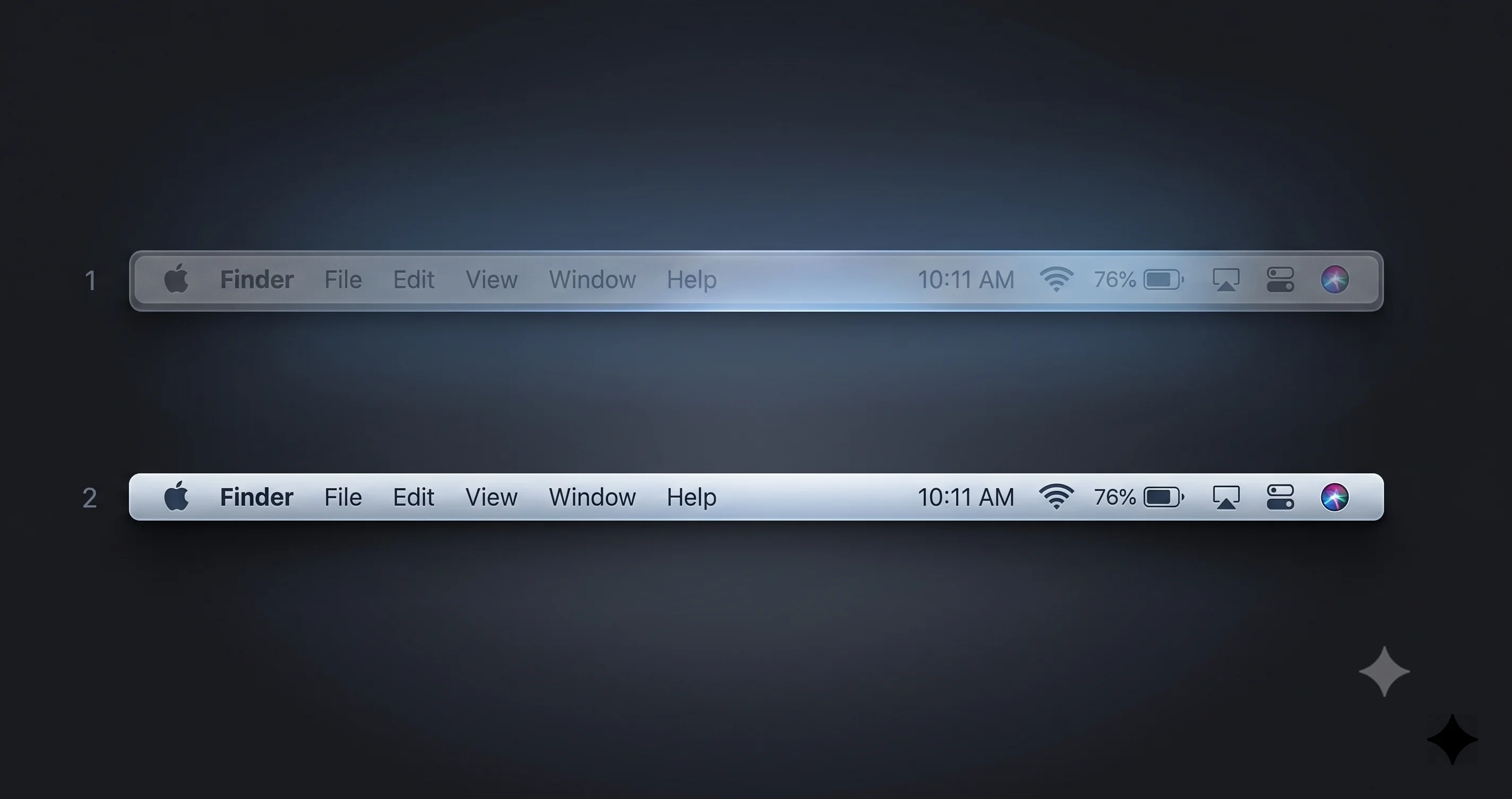
Start with the menu bar, because that is where Tahoe hurt most
The menu bar is the surface people struggled with most, because it is always on screen, it sits directly over the top edge of your wallpaper, and it is full of small text and status glyphs. Set your transparency by watching the menu bar specifically. Open an app with a full set of menus, put a bright or busy wallpaper behind it, and drag the slider toward solid until the menu titles and your status icons are comfortably readable. If the menu bar reads well, the rest of the interface usually follows, because it is close to the worst case.
Choose a wallpaper that cooperates
Transparency legibility is a two-body problem: the material and whatever is behind it. Even with the slider, a hostile wallpaper makes life harder. Wallpapers that help are darker, lower-contrast, and less busy near the screen edges — especially the top edge under the menu bar. Wallpapers that hurt are bright, high-contrast, and detailed, particularly ones with light areas or fine texture along the top. You do not have to give up a photo you love; even nudging to a darker or more uniform image, or one whose busy detail sits in the center rather than the edges, noticeably improves menu bar and sidebar readability. Pairing a cooperative wallpaper with a moderate slider setting gets you further than either alone.
Layer in Increase Contrast when you want harder edges
If, after setting transparency, you still want crisper separation between interface elements — sharper borders, bolder text, clearer button outlines — turn on Increase Contrast in Accessibility. It works alongside the transparency slider: the slider governs how see-through the glass is, and Increase Contrast hardens the outlines and text on top of it. The two together are a powerful combination for anyone who finds the default too soft. And if you want the strongest possible guarantee of a solid interface, layering Reduce Transparency on top of everything else is always available as the final, definitive step.
Understand how the settings interact
The mental model worth carrying: the transparency slider controls translucency (how much shows through the glass); Increase Contrast controls the crispness of borders and text; and Reduce Transparency is the hard override that forces solid materials. They stack. In Tahoe you effectively only had the hard override and Increase Contrast. macOS 27 inserts a smooth, tunable middle layer between "full glass" and "no glass," which is precisely the granularity people were missing. Experiment with combinations — a moderate transparency setting plus Increase Contrast satisfies a lot of people who previously felt forced all the way to Reduce Transparency.
Per-App Behavior and What the Slider Actually Touches
A fair question: does one slider really fix everything everywhere? The honest answer is that it governs the system-level Liquid Glass materials — the menu bar, the Dock, sidebars, toolbars, Control Center, notifications, popovers, and other standard system chrome that use the shared material. Those are the surfaces most people mean when they complain about legibility, and they respond to the slider consistently.
Individual apps are a softer story. Apps that use the standard system materials and controls inherit your transparency preference automatically, which covers most of Apple's own apps and any third-party app built with the standard toolkit. But apps are free to draw custom interfaces, use their own backgrounds, or opt out of certain system materials, and those will not necessarily track the slider the way system chrome does. In practice this means the slider does an excellent job on the surfaces that caused the loudest complaints and a variable job inside apps that go their own way. That is not a flaw so much as a reality of how app rendering works — and because this is beta software, exactly which surfaces honor the slider may still be shifting from build to build. If you notice one particular app ignoring your setting, that is expected behavior, not a bug you need to chase.
Performance: The GPU Cost of Transparency and Blur
There is a practical dimension to transparency beyond looks: it is real graphics work. Every translucent surface has to sample and blur the content behind it in real time, and that blur is computed continuously as windows move, wallpapers animate, and menus open. On a modern Apple silicon Mac with a healthy GPU, this is usually invisible. On lower-powered machines, on Macs driving large or multiple external displays, or under heavy load, all that live blur can show up as extra GPU utilization, warmer temperatures, more fan noise, and occasionally dropped frames in animations.
This is not hypothetical — heavy Liquid Glass rendering has been implicated in real performance issues on the Tahoe line. We covered one prominent case in our guide to WindowServer high CPU with Liquid Glass on multi-display Macs, where the process responsible for compositing the interface pegged the CPU on certain multi-monitor configurations. The transparency slider is not marketed as a performance tool, but there is a logical connection worth understanding: pulling transparency toward the solid end generally means less live blur to compute. A denser, more opaque material can be cheaper to render than a fully translucent one that has to blur a busy background every frame.
So if you run a Mac that struggles with the glass — an older or lower-end Apple silicon model, or a demanding multi-display desk setup — reducing transparency may give you a small, welcome efficiency win on top of the legibility benefit. I want to be careful not to over-promise: Apple has not positioned the slider as a performance control, the exact rendering cost of each slider position in the final release is unknown, and the effect will vary by hardware and workload. But the direction of the relationship is sound, and for anyone chasing both readability and a cooler, quieter machine, a more solid setting is worth trying. Remember that macOS 27 is Apple-silicon-only — the first release to drop Intel and the last to bundle Rosetta 2 — so every Mac that can run it has a capable GPU, which makes these effects far less punishing than they would have been on older hardware.
The Accessibility Angle
It is worth stepping back to appreciate what this change means for accessibility as a discipline. For years, transparency reduction on the Mac was framed purely as an accommodation — a setting you found in the Accessibility pane because it existed for people with specific vision or cognitive needs. That framing had an unintended side effect: a huge number of users who simply found the default hard to read felt like they were reaching for an "accessibility feature" to fix a design choice, which is a slightly awkward and easy-to-miss path.
By promoting a transparency slider to a mainstream appearance control, macOS 27 does something quietly important: it normalizes tuning legibility for everyone. The person who just wants a slightly less see-through menu bar and the person with a genuine visual need are now served by a spectrum of controls rather than a single accessibility switch. That is good inclusive design — the accommodation still exists in full for those who need its guarantees, while the everyday preference is available to all without any "special settings" framing. The dedicated accessibility controls remain the authoritative option when you need a hard, reliable result, and our macOS Tahoe accessibility complete guide remains the best reference for the full accommodation toolkit, most of which carries directly into macOS 27. The slider does not weaken accessibility; it broadens who benefits from the same underlying idea.
How to Get It: Installing the Public Beta
To try the transparency slider today, you need macOS 27, which as of mid-July 2026 means the beta. The first public beta opened on July 13, 2026 (alongside a revised developer beta 3, build 26A5378n), so you no longer need a developer account to get on board — enrolling in the Apple Beta Software Program is enough. But "you can install it" and "you should install it on your main Mac" are very different statements.
Install responsibly
Beta operating systems break things. They can be unstable, they can eat battery, they can be incompatible with apps you depend on, and rolling back from a beta is a genuine hassle that often involves a full erase and restore. The single most important rule is back up first — a full, verified backup you have actually confirmed you can restore from. Better still, install the beta on a secondary Mac or a separate volume rather than the machine you rely on for work, so a bad build never touches your primary environment. Our step-by-step guide to installing the macOS 27 public beta safely walks through backing up, using a separate volume, and enrolling without putting your main setup at risk, and it is the guide to read before you download anything.
Should you install it at all?
For most people, the honest answer is "not on your main machine, not yet." A transparency slider is a nice quality-of-life improvement, but it is not worth the instability of a July beta on the Mac you depend on. If you are curious, weigh it properly — our breakdown of whether to install the macOS 27 developer beta and its known issues lays out the real risks, and while it is written around the developer beta, the caution applies equally to the public beta. If you can wait, the fall general release will bring the same slider in a far more stable package. Remember too that macOS 27 is Apple-silicon-only, so if you are on an Intel Mac, the fall release is not coming to your machine at all — the transparency slider is one more feature that lives exclusively on the M-series line.
Troubleshooting Common Issues
Problem: I cannot find the transparency slider in System Settings. Solution: First confirm you are actually on macOS 27, not Tahoe — the slider does not exist in any Tahoe release, where the only control is the Accessibility toggle. Then check Appearance and Accessibility > Display, since current betas may surface the control in one or both and Apple may relocate it before the final release. If you are on Tahoe, the equivalent is the Reduce Transparency on/off switch, not a slider. And if you are on a very early or partial beta build, the control may simply not be present yet — update to the latest available beta and look again.
Problem: My menu bar is still hard to read even after moving the slider. Solution: Push the slider further toward the solid/opaque end and re-check against your brightest, busiest wallpaper, since that is the worst case. If it still struggles, switch to a darker or lower-contrast wallpaper (especially along the top edge), turn on Increase Contrast in Accessibility for harder text and borders, and as a last resort enable Reduce Transparency for guaranteed solid surfaces. Also verify the setting in both light and dark mode — a level that works in one can fail in the other.
Problem: The slider setting does not seem to affect one particular app. Solution: This is usually expected rather than broken. The slider governs system-level Liquid Glass surfaces — menu bar, Dock, sidebars, toolbars, Control Center, notifications — and apps that draw custom interfaces or opt out of the standard materials will not always follow it. Apps built with standard system controls should track your preference; those with heavily custom UI may not. Because this is beta software, exactly which surfaces honor the slider can also change between builds, so do not treat one stubborn app as a defect.
Problem: Performance or fan noise got worse after I turned transparency up. Solution: Live blur is real GPU work, and more transparency means more of it, which can raise GPU load, temperatures, and fan noise — especially on lower-powered Macs or multi-display setups. Try pulling the slider toward the solid end, which generally reduces the blur that has to be computed. If you are on a multi-monitor configuration and seeing severe compositing load, review our WindowServer high CPU multi-display fix, as those mitigations are relevant to heavy Liquid Glass rendering in general.
Problem: I set my transparency but it looks wrong after switching wallpaper or appearance mode. Solution: That is inherent to how translucency works — legibility depends on the interplay between the glass and whatever is behind it, so changing the wallpaper or flipping between light and dark mode changes the result. Set your transparency level for your worst-case combination (brightest wallpaper, whichever appearance mode reads worse) so you are never caught out. If you frequently change wallpapers, a slightly more solid setting gives you a more consistent experience across all of them.
FAQ
Where is the Liquid Glass transparency slider in macOS 27? In current betas it lives in System Settings, associated with the Appearance and display look of the system, and it may also appear under Accessibility > Display. Because macOS 27 is still in beta, the exact name, wording, and location can change before the fall 2026 release, so check what your specific build shows on screen.
How is the new slider different from Tahoe's Reduce Transparency toggle? Tahoe only offered a binary on/off Accessibility switch: full glass or fully solid, nothing between. macOS 27 adds a continuous slider so you can pick any point along the range, treating transparency as a normal appearance preference rather than an accessibility-only override. The old toggle still exists for those who need a hard, guaranteed-solid result.
Will adjusting transparency fix my unreadable menu bar? For most people, yes. Pulling the slider toward the solid end restores contrast so menu titles and status icons read clearly over busy or bright wallpapers, which was Tahoe's biggest complaint. Pair it with a darker wallpaper along the top edge and, if needed, Increase Contrast, and the menu bar becomes comfortably legible again.
Does reducing transparency improve performance? Possibly, though Apple does not market it that way. Translucency requires live blur, which is real GPU work, so a more solid setting generally means less blur to compute — a small potential win on lower-powered Macs or multi-display setups. The exact effect varies by hardware and workload, and the final release behavior is not yet confirmed.
Can I still use Reduce Transparency in macOS 27? Yes. The accessibility controls, including Reduce Transparency and Increase Contrast, remain in macOS 27 and still serve as the strong, dedicated accommodation for anyone who needs guaranteed solid, high-contrast surfaces. The new slider complements them for everyday tuning; it does not remove them. You can use the slider, the toggles, or both together.
Do I need to install a beta to get the transparency slider? Right now, yes. macOS 27 is in beta as of mid-July 2026, with the first public beta having opened on July 13, 2026. If you want to wait for stability, the feature will arrive with the general release expected in the fall of 2026. Always back up before installing any beta, ideally on a secondary Mac or volume.
Conclusion
The Liquid Glass transparency slider is a small control that fixes a big problem. macOS 27 "Golden Gate" takes the single loudest criticism of the Tahoe redesign — that translucent menu bars and sidebars were often hard to read over real wallpapers — and answers it with exactly the tool people asked for: a granular, mainstream dial that lets you choose how see-through your interface should be, instead of the blunt on/off toggle that was your only option before. Add the surrounding refinements — tighter corners, edge-to-edge sidebars, colored icons, bolder active tabs, better shadows, and a more visible cursor — and macOS 27 reads as a deliberate, focused effort to make the redesign livable.
Keep your expectations calibrated, though. This is beta software, so the slider's name, location, wording, and exact behavior can still shift before the fall release; treat the paths in this guide as where the control logically sits today, not as a permanent address. Set your transparency by watching the menu bar over your busiest wallpaper, check it in both light and dark mode, and layer in Increase Contrast or the dedicated Reduce Transparency accommodation if you need a harder guarantee. If you are running Tahoe today, the Tahoe-era Liquid Glass customization guide covers the on/off approach that the new slider supersedes.
When you are ready to try it, install responsibly: back up first, and put the beta on a secondary Mac or volume rather than the machine you depend on — our guide to installing the macOS 27 public beta safely shows you how. Then open System Settings, find the transparency slider, and finally tune Liquid Glass to look the way you always wanted it to.